
Tue Oct 01 09:07:26 UTC 2024: ## Sendwave Surfs a New Wave of Branding with Community Focus
**London, UK** – Digital money transfer platform Sendwave has unveiled a fresh brand identity that aims to capture the essence of its global community and its mission of making money transfers as easy as texting.
The rebranding, spearheaded by DesignStudio, emphasizes Sendwave’s commitment to its user base, primarily migrants seeking to send money home. Through immersive workshops and user feedback, the agency crafted a brand identity that is “always community-centered,” according to DesignStudio.
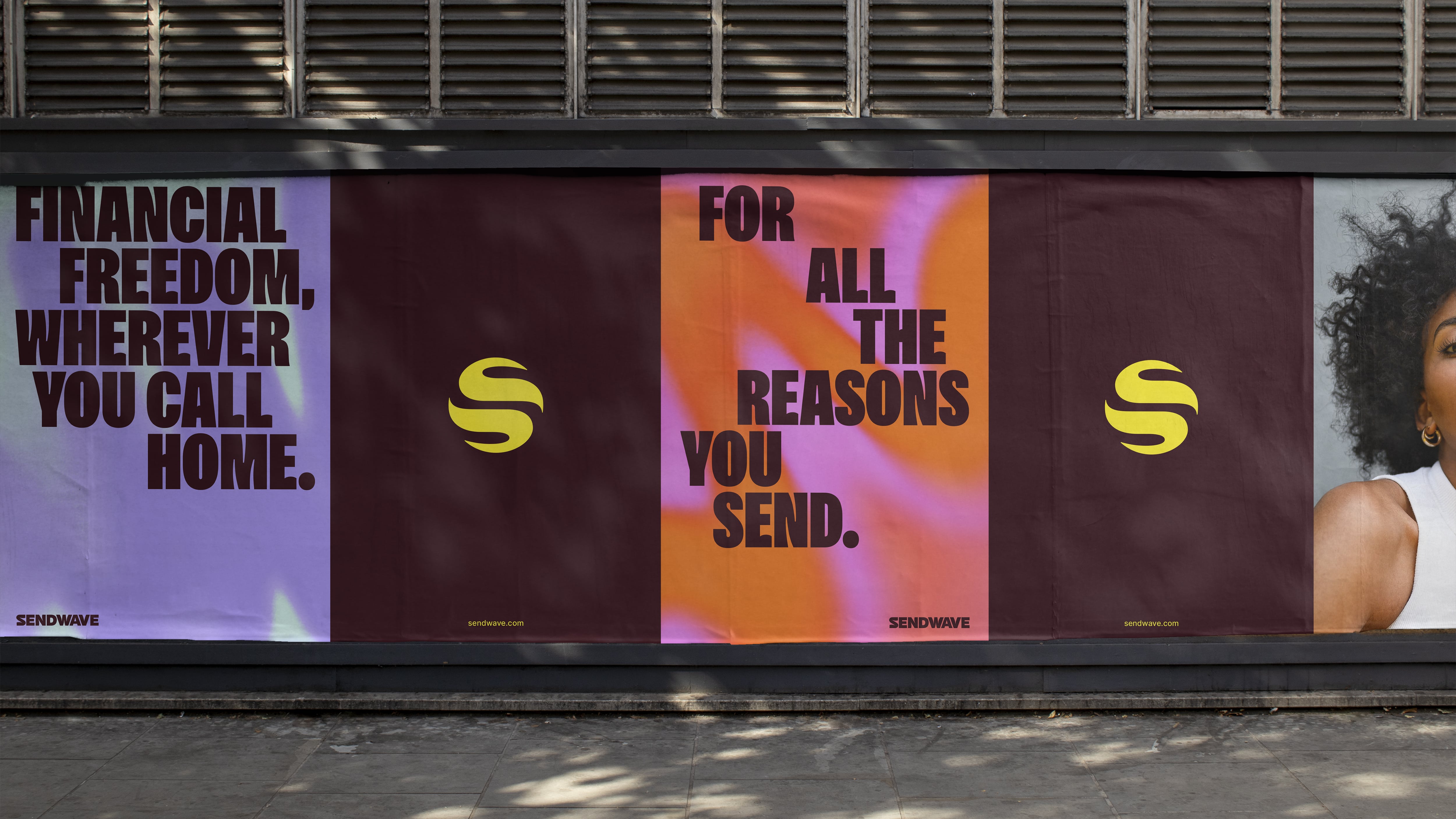
The new logo is a simple yet powerful representation of Sendwave’s global reach. Comprised of two “S” shapes, the logo seamlessly merges into a swirling globe, symbolizing the transfer of money across borders. The full wordmark, while aesthetically pleasing, adopts a dark maroon tone that might not be as eye-catching as the logo.
DesignStudio also collaborated with Florian Karsten Type Foundry to develop the custom Sendwavy typeface, infused with a playful wave motif that underscores the brand’s dynamic nature. The wave imagery extends throughout the brand’s visual identity, signifying the collective movement of a community.
The brand’s tone of voice embraces a “warm and relatable” approach, shifting away from the traditional, authoritative language often found in finance-focused brands. The tagline, “For here. For there. For home,” while potentially lacking in catchiness, emphasizes Sendwave’s connection to its diverse user base.
The rebranding breaks traditional finance industry norms, opting for a playful and energetic aesthetic. While some may perceive this approach as more style than substance, Sendwave’s focus on community and user experience suggests a strong foundation for this bold brand evolution.
