
Thu Sep 19 09:00:00 UTC 2024: ## Sans Serif: From Humble Beginnings to Digital Domination
**London, UK** – Typography Week shines a light on the evolution of sans serif fonts, tracing their journey from obscurity to becoming the ubiquitous choice in the digital age.
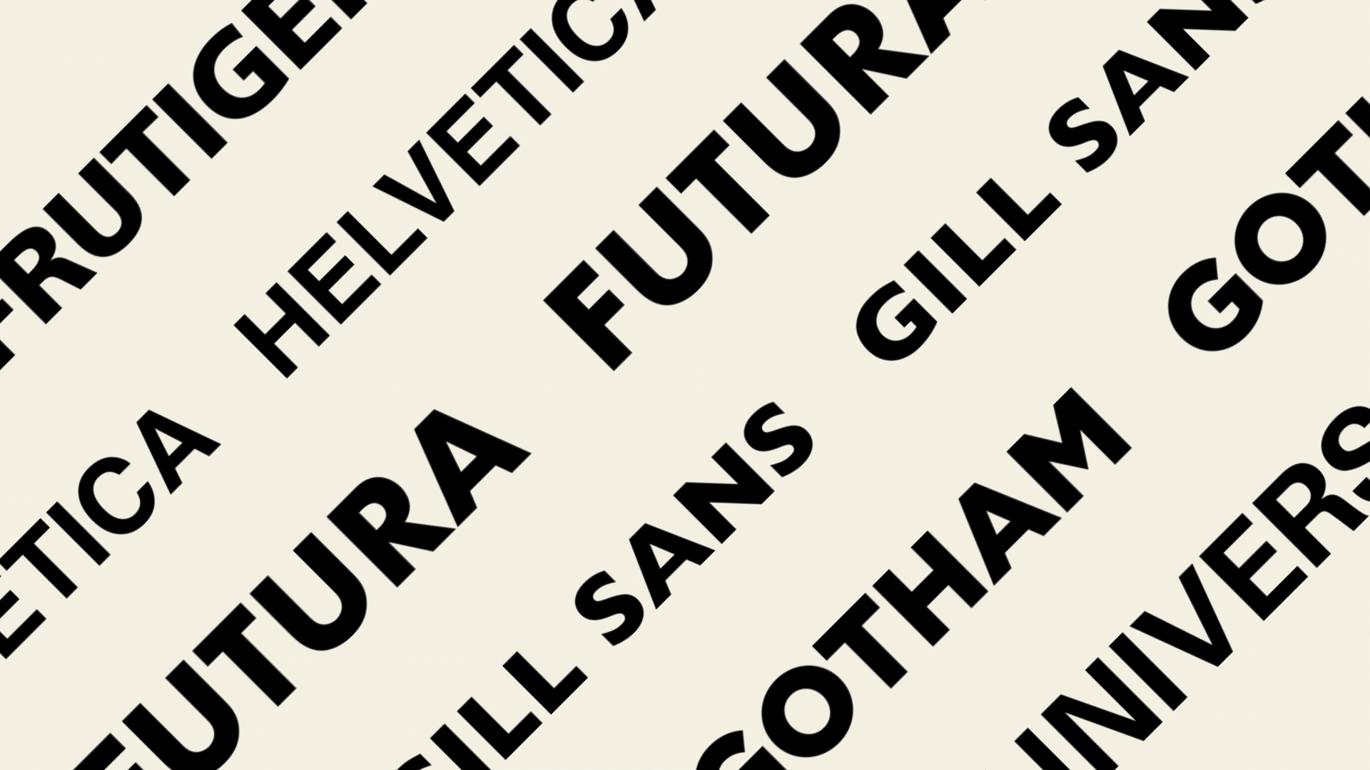
While serif fonts reigned supreme for centuries, the sans serif emerged in the 19th century, initially used for advertising and headlines. Its clean, geometric forms resonated with the rise of modernism and the Bauhaus movement, leading to the creation of iconic fonts like Futura and Gill Sans.
The mid-20th century saw the emergence of Helvetica and Univers, both born in Switzerland and quickly becoming staples of international design. The advent of digital displays further cemented the dominance of sans serif fonts, as their legibility proved superior in smaller sizes and lower resolutions.
Despite initial concerns about readability, research has shown that sans serif fonts are just as effective as serif fonts in conveying information. In fact, the rise of digital technology has led to a proliferation of sans serif fonts, with designers creating new and innovative styles for a variety of applications.
While sans serif fonts have become the go-to choice for many designers, some argue that their widespread use risks homogenizing visual language. As technology continues to evolve, it remains to be seen how the future of sans serif fonts will unfold. Will AI usher in a new era of typography? Only time will tell.
